Thursday, 16 December 2010

How choices made relate to target audience

Front Cover:


- For the front cover it was a combination of the articles chosen and the related images (local figures such as the recycling manager and local schools such as HGS). The new building information will be interesting to both students and parents alike, so it appeals to two parts of my demographic. This is the same for my 2nd page.

Website:


- For the website, it appeals to the target audience in a similar way to the paper but also appeals to a wider audience. This audience will be more ‘computer-savvy’, although the site is simple enough to use for those who aren’t. Again images and articles appeal to the locality of my target audience.

Poster:


- For my poster I felt I should include some images as while The Sun’s poster is good at aiming at its target audience by listing the features and styles in the paper – it fails to relate to them by giving no examples through imagery. Similarly with The Guardian’s, most of their posters aren’t even for the newspaper in general but for specific features (here it is a WW2 article). I attempted to relate to the target audience by following the stereotypes; the mother is more interested in local events (such as school walks, shops opening etc), the children are more interested in the comics located in the back, the father focuses mainly on the sport, and the young man in the shirt and tie goes for the business section. By doing so and using a family atmosphere it attracts my target audience.

Audience feedback on final products

Front cover:


Second page:


Poster:


Audience feedback on the final products were very good, all commenting saying how the front cover and 2nd page were successful in mimicking a real newspaper. Remarks made to the images and the actual text were also positive. The only negative was that the poster ‘doesn’t look like a real newspaper’s advert/poster’. I attempted to address this by adding information about the paper at the bottom – but the design was intentional; to not follow the norms and conventions of a newspaper poster. I felt with the front cover, second page and website I had followed the theme well, so I should do something slightly different from the norm with the poster but nothing radical.


Website:


Although there was no initial audience feedback on my website (instead I modelled it on another), mid-production feedback again helped me to add in features, widgets and more to make it feel like a real newspaper website. Feedback on the completed product commented on how the layout, articles and widgets all made it look professional. One negative feedback was that it was too bare – I have tried to address this as much I can.

Wednesday, 1 December 2010

Newspaper poster research

To create an advertisement poster for my own newspaper, I have researched the generic conventions of these national newspaper posters. The two newspapers I chose as examples are The Guardian and The Sun.


This advert is for a 7 part series on World War II for The Guardian and The Observer. The design itself is quite minimalistic, stylish, and catches the eye - which is what my own poster will adhere to. The contrasting colours of red/blue and black/white also help the overall effect.


This poster works very well as it literally lists all the features in the paper. To someone who knows nothing about The Sun, they can easily deduct what it's about just from the poster.

My final poster after research and production:

Monday, 22 November 2010

Website construction

The severe limitations of sites.google (mainly because it is free) do not allow me to fully design my newspapers websites which I envisioned - nevertheless the layout does resemble a real paper website domain, plus the articles and pictures follow the norms and conventions of the newspapers and sites I researched.

Here is a selection of images which show the construction process and image creation I did while making the website for my newspaper.


Further in construction:

Thursday, 18 November 2010

Website Articles

Here are two articles I have created which shall be uploaded to the website.

Cook joins Town

Joining the club on a permanent basis from Blue Square Bet Premier club Gateshead is 22 year old Mark Cook. Mark was at Hartlepool United last season, and prior to that came up through the ranks at Newcastle United. Gateshead manager Ian Bogie commented saying: "We do not need to run with three goalkeepers but I thank him for his efforts during his time at Gateshead and wish him well at Harrogate."

In news also relating to Harrogate Town, the team will now travel to Hyde on Saturday 6 November for a fixture (KO 3pm). Both clubs were without a fixture on this date as result of their originally scheduled opponents still being involved in the FA Cup. Having exhausted other options to re-arrange a game for Saturday 6 November, Harrogate Town has agreed with Hyde to bring forward the match that was due to be played in March. The change leaves Harrogate Town with only two games in March, but leaves free dates for re-arrangements should there be weather postponements in the upcoming winter season.
A new date for the home match against Corby Town has not been confirmed as of yet.

----------------------------------

Harrogate nightclub closes its doors

One of Harrogate's top nightspots has unexpectedly ceased trading. The Blue Monkey nightclub on Station Parade – formerly Carringtons – shut its doors last weekend, cancelling its entire catalogue of events for the autumn and winter.
A spokesman said the reason the club had closed was because it was "not cost-effective at the moment" to continue, but said that the owner hopes to re-open when conditions are more favourable.

Organiser Dorothy Barichard said: "I'd arranged one night with the manager, who kindly agreed to provide the venue free of charge. I didn't hear anything for a while, so I called to make sure everything was OK. I was told he'd left and that they weren't aware they were hosting our event.
"They said the club was closing because they couldn't pay the bills. I didn't get the impression they were opening again; it sounded like that was the end of it."
The property was previously owned by Carringtons, which had been a fixture of the Harrogate night-scene since 1975. The Blue Monkey launched in March to provide a fresh take but has ultimately been unsuccessful.

Tuesday, 2 November 2010

Generic conventions of two newspaper websites (home page) + semiotic analysis

Harrogate Advertiser (click to enlarge):


Firstly, the Harrogate Advertiser banner is located near the top of the screen. This is the same banner as used in the newspaper, showing consistency. Above this is an animated advert plus register/sign in buttons for visitors and members.

Below the banner there are eight hyperlinks to different areas of the website which enables easy access and movement around the website. To the right of this there is a search bar, which enables you to search through the site or on the web. Below this there are two main Harrogate news stories, one sport story and a magazine review.

A large portion of the home page is covered in advertisement, one of the main conventions you will always see on a newspaper website (seen on all sites I have researched) is adverts. This is an example of synergy; mutual benefit for all. The advertisers gain more views and the site receives money for ‘renting’ out an advertising space.

To the right of the large section of adverts, there is another section primarily for this week’s top /popular stories.
Another generic convention the website uses is the date just below the banner, which is also what the newspaper does.

In terms of font - apart from the Harrogate Advertiser banner, all the text on screen is Arial (a common font style for websites)varying in size; size 12 for article titles, and 9 for everything else. On the contrary, the actual newspaper uses the traditional Times New Roman,also a common font style for newspapers.

At the time the screenshot was taken, only one picture included a person - this is strange as usually newspapers like to have pictures of people to make it more interesting. This isn't a big problem here however, as a picture of fireworks is just as interesting to the target audience.

Looking at cohesion of colours, it is clear that the colour theme is predominately blue with a few yellow/orange combinations in pictures/when you highlight a hyperlink.

For news values, there is an example of the threshold/amplitude value (the size of an event will govern the amount of attention it is given) which is the bonfire night article. While the size of this event if relatively small in the sense of the nation, it is quite a big local community activity.

York Press (click to enlarge):


The layout is quite similar to the Harrogate Advertiser, but compared to other newspaper websites I have researched (Nidderdale Herald, Yorkshire Evening Post) it is the most different as the other sites are all produced by the same web designer; therefore having a near identical layout to one another.

As with the others there is the main banner, an animated advertisement , a search bar, and the register/sign in buttons. Below this are hyperlinks to main categories such as Sport, Leisure, etc for ease of use around the site. The date is above the banner instead of below as it was on the Harrogate Advertiser website.

The rest of the website is slightly different however. The latest headlines are all located to the left of the screen, while the middle section includes a ‘most read/most comments’ area, photos, and also a ‘buy & sell’ feature. To the right of this there are few advertisements and local information. These adverts, as said above for the Harrogate Advertiser website, are an example of synergy.

Looking at the typeface, a large variety is used -

Thursday, 28 October 2010

Headlines

By looking at the resuslts of the questionnaire, we can see that 'Harrogate Post' was the most popular choice of name. After I had decided on the classical Times New Roman font - I tried a couple different colour schemes before finally landing on light blue.


I decided against a green colour scheme as it would give the wrong impression, as most papers/leaflets which solely focus on recycling and the environment use green as their main colour.


I decided against red also because it is more common for tabloids to have this colour scheme - this is where the term 'red tops' come from (see: The Sun, Daily Star etc).

Thursday, 14 October 2010

Audience feedback on final choice of photos

Here are a few of my final choices of images that I will put in my paper.


Feedback: "Good composition -shows whole building which serves its purpose."


Feedback: "Shows main entrance of building and sign - plus includes people/customers in the image which helps locality theme."

Sunday, 10 October 2010

Image Manipulation

Here are some screenshots evidencing image manipulation:

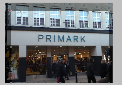
Here I am cropping the image to fine tune the composition of the image by deleting the unwanted empty sides of the image.


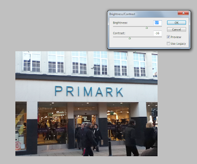
Here I am editing the contrast/brightness to make the image pop out more to the reader.

I used Photoshop CS4 and Photoshop Elements for all image manipulation.

Monday, 4 October 2010

Draft article #4

HARROGATE RECYCLING SERVICE IN FOR A MAJOR OVERHAUL

HARROGATE’S much criticised recycling system looks set for a complete recall.
Plans put forward include adding cardboard and plastic bottles to kerbside collections, replacing the black sack service with wheelie bins, and a weekly collection alternating between waste and recycling.

Grant Blakemore, from Friends of the Earth, has secured more than a thousand signatures from local residents demanding an improved service and has commented, “By signing our petition, the public is giving the council a clear message that they want to see a significant change in the recycling system.”

The Harrogate Post has revealed that last year the district was the lowest in terms of recycling household waste in North Yorkshire – at nine percent below the national target.

The council says the detail of its waste and recycling service will be planned with assessments for those in remote areas, unable to accommodate a wheelie bin.

Draft article #3

LEEDS FESTIVAL 2010

APART from a few complaints about the quality of Guns n Roses frontman Axl Rose, reports have been largely excellent. Celebrating his A-level results, local student James Ford said, “It was the best in years!”

Our own festival reviewer here at the Harrogate Post reported the only disappointment was Axl Rose’s performance. After Reading, where he was an hour late, one would expect that he would be on time. After a half hour delay GnR finally came on stage and was victim to mixed reviews even though they broke the allotted time and played past the curfew.

Also, compared to last year’s Sunday riots it was relatively quiet with only a few small issues with congestion near the NME tent.

Draft article #2

Small article.

SKATE PARK

THE borough council has confirmed that Harrogate will have its first permanent skatepark by January next year.

Changes to the design have been undertaken to cater for skateboarders as well as bikers and rollerbladers. The design has been submitted this month and is presented before planners in November.

Draft Article #1

HARROGATE GRAMMAR FINISHES SIXTH FORM BLOCK

AFTER an arduous year long construction the new 6th form has finally been completed for the new students, while last year’s lower sixth now integrate their lessons into the new block. The building and its facilities have promised to considerably improve the quality of work produced; as improvements such as the Media Suite introduce a brand new operating system, Windows 7, and desks which include a rail system allowing the computer screens to slide underneath the table for traditional handwritten lessons. Media student Will Taylor said, “It’s pretty impressive and will definitely help me with my work.”

For assemblies, drama, and music lessons there is the Forum – a large auditorium style hall including seats which can fold into the wall providing larger space for students that need it. It also has a large cinema sized projector and microphones / speakers surrounding the whole room. For relaxation, there is the ‘Cloister’, an open area located in the centre of the new block featuring a small fountain, flora and benches. Hopefully this can create a tranquil atmosphere which students can take advantage of for learning.

The ambitious project required a £2 million grant from the Learning and Skills council, this isn’t the first time Harrogate Grammar School has been generously given a sum of money to help further improve the establishment. Just a few years ago, the school received £1 million to re-build the library to be bigger and better.

Mode of Address

Modes of address can be defined as the ways in which relations between addresser and addressee are constructed in a text. In order to communicate, a producer of any text must make some assumptions about an intended audience; reflections of such assumptions may be discerned in the text. This can directly affect register and formailty depending on the target audience.

Examples include direct (pronouns such as 'you' would be used), colloquial (extreme slang is used) and exclusive (the text only applies to a certain group).

For my newspaper, I will keep formal mode of address and use quite broad lexis so it isn't too exlcusive when discussing a subject.

Sunday, 3 October 2010

Second page analysis (Yorkshire Evening Post)


On the second page of the Yorkshire Evening Post there is a total of five articles, again varying in size. Down the left hand side there is an article (‘Huge cuts to roads budget) which nearly takes up the whole left hand column – stopped by a story only two paragraphs long at the bottom left of the page (‘Search for Cinderella’). The main article takes up half the page, with a small picture relating to the story. Nearly half of the main article’s space is taken up by the large bold, serif title.

The bottom half of the page is taken up by a boxout which is mostly pictures. The story has one medium, and two small sized pictures which are all medium to long shots. Below the pictures includes a long caption describing each picture separately.
Each article on the page is divided by a thin black line to make it look more organised.

Out of the two newspapers (Yorkshire Evening Post and Harrogate Advertiser) I will model my front cover on the Harrogate Advertiser, while my second page will be a mix of the two.

Sunday, 26 September 2010

Second page analysis (Harrogate Advertiser)


On the second page of the Harrogate Advertiser there are twelve articles, all ranging in size. The main article fills up the top third of the page and is surrounded by a thin black border to encase it. The related picture takes up most of this space, the actual story columns only take up one quarter of the box, and the title is in bold and the largest on the page.

Four of the columns down the left hand side are very small articles, ranging from 2-7 paragraphs each and only have one column. Below these at the bottom of the page there are slightly larger, including two columns. I will most likely use this layout in my own design. Also, each story is divided from one another with a pale grey line.

At the bottom right there is an advert placement, I may attempt to create my own advert for my newspaper. Also, each picture has a caption underneath stating a summary of the article; the two pictures on the page are either extreme close up or long shots.

Monday, 20 September 2010

Semiotic Analysis of second front cover (Yorkshire Evening Post)


Unlike the Harrogate Advertiser; the masthead is located at the top of the page, and below that are the lures. The masthead includes a variety of typefaces – the ‘Yorkshire’ is in full capitals, sans-serif and black. The ‘Evening Post’ is in a much larger serif font, is pale blue (the boxes the lures are in are consistent and also pale blue) and has a thin border around each letter. In-between the two words there is an image of the Yorkshire Rose to show that it is a local paper. Below the masthead but above the two lures there is the website, date and price of the newspaper.

The front page mainly consists of one article, but also a large picture for another article which continues on page 2. The picture is a medium shot and is surrounded by a thin grey border to keep it separate from the other main story. The title is in a very large font with a smaller subtitle just below – just before the article starts it states the writer, his position at the newspaper and the exclusivity of the story. The first word of the article follows the generic conventions of all newspaper stories; in capitals. Also the whole first paragraph is in slightly larger font from the rest.

At the bottom of the page there is an advert, considerably smaller compared to the one at the bottom of the Harrogate Advertiser. This again is an example of synergy.

From both of these semiotic analyses, I will model my front cover on a variation of the two.

Sunday, 19 September 2010

Semiotic Analysis of front cover (Harrogate Advertiser)

**----picture here----**

The masthead includes the name of the local area that it reports for and has two different styles of font, although both serif, the ‘Harrogate’ is in bold while the ‘Advertiser’ is in italics. The writing is outlined with a large blue box to make it stand out to the reader, easily viewable from a shelf. This helps it stand out from the rest as some other broadsheets are black and white, while tabloids usually stick to red (The Sun etc). Just above the masthead but still within the blue box there is a small subtitle saying: “Voice of the town since 1836”, showing that it represents the town and has done so for a long time to become a household name. Beneath the blue box there is the date, website and price; a generic convention of all newspapers. Also at the bottom left above the advertisement there is also the recycling logo and barcode.

Above the masthead are two lures, created to ‘lure’ the reader into purchasing the paper with interesting features. Here it includes a ‘free DVD for every reader’ and ‘Starbeck Gala picture special’ with a dividing line down the middle to separate the two. Note how both these lure titles are the same colour as the masthead box to show consistency, but are all in capitals and sans-serif to make them stand out at the top. They also have picture cutouts from the gala and DVD to further entice the buyer.

In total there are five articles featured on the front page. They all follow the simple format of small columns , with a few of them interspersed with pictures relating to the story. The main article is surrounded by a thin black border (Hospital almost at full capacity) with other minor articles around this acting as another border. There are different types of titles here, two of them are large and bold while the other three are slightly smaller and the text is not bold. This is done to show which stories are more important for the community despite all of them being on the front page.

Each article starts with the first word capitalised, although in some cases where the story starts with an ‘A’ , the following word is also in capitals. This technique is used to draw the reader in and also to start the article confidently. The main story, ‘Hospital almost at full capacity’, finishes with a message from the editor requesting concerns about the article and the text is in bold and bullet pointed to stand out from the columned text of the story. The message provides an email address and street address, encouraging community-level interaction with the editor.

The pictures on the front cover range from medium to small size, saving the larger pictures for inside the paper. The pictures are straightforward, containing the person/place/problem the article is dealing with. Below the pictures there is a caption, for the most part they solely contain proper nouns to state the name or place of the picture.

On the right hand side of the front cover there is a smaller blue box tab with the words ‘inside...’ – with stories which could interest the public such as Leeds Festival news, the New Look library and free open days around the district. Below this there is another similar tab for the website, saying ‘online...’, which has a voting poll. This is an example of media coming together.

Located at the bottom of the page is a large advertisement from a carpeting company. This is an example of synergy as both gain from it; the company pays the newspaper for the ad space while the carpeters receive more customers as a result.

Wednesday, 15 September 2010

Questionnaire, Results + Analysis

1. Are you male or female?

[] Male [] Female


From this it shows that the readership are mostly female but only by a small amount. It is interesting that they are almost equal, and I shall cater my articles/opinions to both genders.

2. Which age gap do you fit into?

[] 13-17 [] 18-22 [] 22-30 [] 30-40+


Judging from this it shows that a large amount of local newspaper readers are 30-40+. This is probably due to the content found in these papers, compared to magazines younger audiences would stereotypically buy.

3. How often do you buy local newspapers?

[] Regularly [] Often [] Occasionally [] Never


This obviously shows that people buy local newspapers often, and indicates the community interest by the amount they purchase one.

4. How much would you be prepared pay for a local newspaper?

[] 75p or under [] £1 -1.50 [] £2-2.50 or higher


This shows that the community would like a high quality paper without being too expensive. 75p or under might make people think the articles may be tacky or ‘tabloid-esque’.

5. Do you use your local newspaper as your main source of news?

[] Yes [] No - please specify others(TV, national papers, internet, radio etc)

-----------------------------------------


Judging from this, for national/international news most people go to other types of media. I will focus all my stories/adverts etc on local events and products.

6. Which title would you prefer as your local paper?

[] Harrogate Post [] Harrogate Letter [] Harrogate Link


This shows that the general consensus is that the Harrogate Post is the preferred choice.

7. Where do you get your local newspaper from?

[] Local shop [] Supermarket [] Delivery


If on sale, this shows where I would decide to sell to my main market and target audience.

8. How often would you want a newspaper to come out?

[] Weekly [] Monthly


9. What news stories would you be most interested in?

[] Hard news [] Human Interest [] Entertainment [] Sports


Here is what my articles and other elements of the paper will be based on; Hard News and Human Interest came out on top, although I may feature some small stories and/or adverts on Entertainment and Sports.

10. Would you like advertisements/family notices in your local newspaper?

[] yes [] no


From this result I can now look to design my own advert (mostly likely to be placed at the bottom of the front page).

From these results I recieved from handing out questionnaires to locals/peers, I can now shape my newspaper to the reader's needs and wants.

Tuesday, 7 September 2010

Proposal

My local newspaper is going to be based on the Harrogate town area and will touch on a range of local issues including human interests and hard news including elections , social events and more. It will focus on more news like this and omit any gossip/celeb scandals that tabloids would use.

Any national event will be looked on from a local perspective and how it specifically affects the Harrogate area; also my paper will be politically neutral to reach a larger audience. It will be ideologically conservative and maintain the status quo.

My target audience will be local families but mainly focusing on the middle aged parents. This ensures that the content is diverse and not constricted to just one style - so all people can enjoy it. It is also aimed at families so when a family member is featured in the newspaper at a public event - the whole family would buy a copy to see.

Tuesday, 29 June 2010

Information for local papers

Circulation:

Harrogate Advertiser
- 15,621

Knareborough Post - 3,400

Wetherby News - 5,004


Sector Coverage


Postcode-------Circulation----Households------% Penetration

HG1 1-5------------7133---------15774-------------48.23%
HG2 0,7-9----------7172---------14330-------------53.54%
HG3 1-5------------3504---------11425-------------35.05%
HG4 1-5------------4477---------11131-------------46.96%
HG5 0,8-9----------3004---------7666--------------41.35%
LS22 4-7-----------2672---------6848--------------45.59%
LS23 6-7-----------1060---------3695--------------28.69%
LS24 8-9-----------528----------4836--------------10.92%
YO26 7-8-----------387----------2075--------------18.65%
YO51 9-------------1193---------2318--------------58.63%
YO61 2-------------26-----------497---------------5.23%
YO7 1-4------------504----------7948--------------6.34%

TOTAL
------------31,660-------88,543------------35.76%

Due to the circulation the Harrogate Advertiser recieves, I will model my newspaper on the style as not to alienate people from radically new papers. While keeping it familiar; I will not directly copy and will try to keep the newspaper as unique as possible.

Monday, 28 June 2010

Front page categories

Four main categories for local newspapers include Human Interest, Hard News, Entertainment and Sport.

Harrogate Advertiser

Human Interest: Motorists shocked by naked man cavorting at roadside.
Hard News: MP's £40,000 farewell payout.
Entertainment: Thousands head to bed race.
Sport: Fears among the cheers as World Cup kicks off.

tbc

Thursday, 24 June 2010

Generic conventions

Advertorial - an advertisement disguised as part of the editorial content of the newspaper or magazine.

Banner - front page headline which goes across the full width of the page.

Byline - the name of the journalist who has written the article or feature.

Caption - written text under a photograph or drawing to anchor the image.

Cover lines - summaries of the most enticing features and articles which are inside the magazine.

Editorial - a statement or comment by the editor of a magazine or newspaper (often placed near the front pages of a magazine).

Gutter - space between pages in a centre spread; sometimes used as space between two columns.

Headline - the main heading with the biggest font which relates to the main story.

Lure - A small section of a story is printed on the front page to entice readers; and the full story is advertised as continuing inside.

Masthead - the title at the top of the front page which identifies the newspaper.

Standfirst - the introductory paragraph before the main article.

Strapline - the headline in smaller font appearing above or below the main headline.

Friday, 18 June 2010

News Values

News values, sometimes called news criteria, determine how much prominence a news story is given by a media outlet, and the attention it is given by the audience. News values are not universal and can vary widely between different cultures.

Decisions on the selection and prioritization of news are made by editors on the basis of their experience and intuition, although several factors are consistently applied across a range of news organizations; news values themselves are the same no matter which TV company or newspaper you work for but different companies place priority on different news values.

List of widely used news values:
1. Frequency - The more similar the frequency of the event is to the frequency of the news medium, the more likely it is to be recorded - and the details are quickly established.

2. Threshold/amplitude/numbers - The size of an event will govern the amount of attention it is given. E.g. World Cup

3. Unambiguity - The simplicity of a story will also make it more attractive to the media as it will be easier for the journalist to investigate and easier for the audience to understand.

4. Meaningfulness - Culturally relevant or culturally prominate events are more likely to make the news. The news audience is far more interested in events which have happened close to home or events which contain references to values, beliefs and attitudes that it shares. E.g. Elections in home country.

5. Consonance - Events which meet our expectations are more likely to become news.

6. Unexpected/surprise - Conversely, events which hold a large element of surprise are also more likely to hit the headlines. E.g. murder etc

7. Continuity - Events which have initially been defined as news will continue to carry importance in news agenda. E.g. An ongoing war.

8. Composition - Most news organisations try to balance their news output. Often, news editors will try and ensure that a balance of home and foreign news is preserved or that there is an element of lighter news within a news bulletin to make it less depressing. Hence, the 'dead donkey' story at the end of the news bulletins. These stories would not in other circumstances be considered as newsworthy.

9. Reference to elite nations - Other major Western nations such as the USA, Germany, France are more likely to get in the news even if it is perhaps only one person being killed than are Third World nations.

10. Reference to elite persons - As above, major Western figures of importance are more likely to get in the news moreso than Thirld World leaders.

11. Personalisation - Events which are peronalised are more likely to be reported than those which have no specific individual concerned - these stories are more common in tabloids than broadsheets.

12. Negativity - Bad news makes good news!

Relatively new compared to the rest of the list:
13. Actuality - If a news station has some video, a newspaper has a picture or a radio station has a soundbite of an event then this story is more likely to be reported than those without.

Overall, news is a construction by the editor selecting what is worthy or not.